KFC and its agency JKR last week unveiled the KFC rebrand they’re calling the brand’s “next chapter.” New logo, refreshed Colonel, new bucket design, new packaging, new restaurants, even a new tone of voice. They’ve given the whole thing a name too. The Bucketverse.
Quick version if you haven’t seen it. Red, white and black stays, but there’s now a second “Herbs and Spices” palette sitting alongside it. The Colonel has a slightly thicker outline and a collar now, which apparently makes him look friendlier. The bucket itself has been redrawn so it can be used as a frame for photos and illustrations across every market, not just packaging. They even built their own typefaces, Kentucky Fried Serif and Kentucky Fried Sans, which to me is amusingly positive. And “Finger Lickin’ Good” isn’t just a tagline anymore, KFC is calling it a standard of behaviour. If you want to see the actual designs up close, It’s Nice That has the full visual breakdown.
It’s rolling out in the UK and Ireland first, then Australia and the US, then everywhere else through the year. Eventually it touches over 34,000 restaurants in more than 150 countries. Fun fact: a new KFC opens somewhere in the world roughly every three and a half hours.
I’ve been teaching introductory marketing at a local polytechnic this term, and reading through the coverage on this rebrand, three things kept coming to mind.
1. The KFC rebrand isn’t short on recognition. It’s short on relevance.
Brand equity comes down to four things. Differentiation, how much the brand stands out. Relevance, how well it still fits what people want today. Knowledge, how much people actually know about it. And esteem, how much people respect it. I covered it in my other article on Levi’s at the World Cup last week.
KFC has never struggled with knowledge. The bucket, the Colonel, the stripes, you know it instantly, anywhere in the world. Differentiation has been strong too. Nobody mixes up a KFC bucket with anything else.
Relevance is the one that’s been slipping. The Drum’s Vicky Bullen wrote about this directly, pointing out that KFC has barely changed in decades, and that’s exactly the kind of thing that lets sharper, newer competitors walk past you, quietly.
So this rebrand isn’t really about getting more famous. I mean KFC is already famous. It’s about whether they still feel current.
2. Most of what’s changed sits at the easiest level to copy.
You can position a brand at three levels. The first is attributes, what the product physically does. Easiest level, and the easiest for anyone else to copy. The second is benefits, what it does for the customer. The third, and the hardest one to actually build, is values. The level where people feel something, not just notice something.
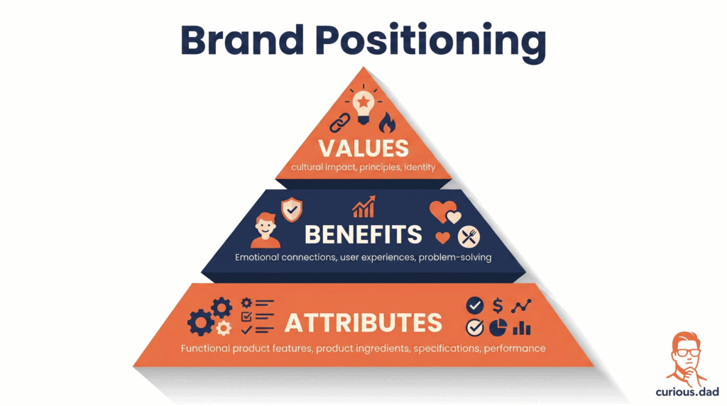
Almost everything in this rebrand sits at level one. New bucket. New Colonel. New typefaces. New colours. It’s genuinely well done, the design press has been kind to it, Creative Boom’s reviewer said the announcement made them smile before they’d even finished reading it. But good attribute-level work isn’t the same as a values claim.
JKR has this new term, QXR, quick experience restaurants instead of quick service. It points at something more emotional. Right now though it still reads more like a label than something KFC has actually built a belief system around. Maybe that comes later. It just isn’t here yet.
3. A new logo is a signal. It’s not proof of anything by itself.
This is the part that I think matters most, and it’s also where I noticed the coverage splitting in two.
Brands often redesign logos specifically to signal a shift, to feel newer or to reach people who weren’t paying attention before. Pepsi has done this more than once, each time keeping something familiar while looking current.
KFC is doing exactly that here, and doing it confidently. But a signal only means something if what follows backs it up. Brand management needs honest, regular checking of where a brand actually stands, not just how it looks.
This is where the split shows up. Design writers have mostly praised the craft on its own terms. The strategy side, Bullen again, is asking whether the actual restaurants and menu are moving fast enough to hold off newer chicken chains like Raising Cane’s and Slim Chickens, both expanding hard into markets KFC has always owned.
History isn’t kind to brands that look fresh but move slow. Hoover lost to Dyson. Pizza Hut lost ground to Domino’s. The ones that survived usually backed the new look with real change underneath, not just packaging.
So where does that leave it
I don’t think this KFC rebrand got it wrong. The craft is genuinely good, and evolving a brand this old without losing what people love about it is hard to do well. But I think it’s too early to call this a win or a miss either way. The visuals are done. What actually decides whether it works is everything that hasn’t happened yet, whether the next-gen restaurants in places like Texas and Dubai change how people experience KFC and not just how it looks, whether QXR becomes something customers feel rather than a phrase in a press release, whether the relevance gap Bullen pointed at actually closes once people are standing in the new stores rather than just seeing the new logo online.
Design can launch on day one. Relevance gets earned over the months after.
One small credit while I’m here though. Redesigning the world’s most recognisable colonel with the bow tie and not ending up with a stick figure who just discovered Paint is its own quiet win. JKR earned that one.
Curious where you land on this one, fellow marketers, and even some of my students if you’re reading this. Does good craft buy a brand time to catch up on the harder stuff, or does a rebrand need to prove itself from day one? Let me know in the comments, I read all of them.